Tuesday, 29 March 2016
Tuesday, 15 March 2016
Evaluation: Archive of Every Evaluation Question
In order to fully evaluate our Advanced Portfolio, and go in depth about the amount of work and effort put into each one, I am going to do a set of four evaluation pieces. These will help explain where I think myself and my group are at as we go along to the end of the coursework period.
These will be updated upon completion, and a link to each blog post will be supplied.
These will be updated upon completion, and a link to each blog post will be supplied.
In what ways does your media product use, develop or challenge forms and conventions of real media products?
How effective is the combination of your main product and ancillary texts?
What have you learned from the audience feedback?
How did you use media technologies in the construction and research, planning and evaluation stages?
Wednesday, 20 January 2016
Evaluation: 4. How did you use media technologies in the construction and research, planning and evaluation stages?
In order to answer this question properly, I decided to create a Bubbl.us mind map to show a brief summary of the media technologies used for AS as well as A2 portfolio construction. This can be found here, or below.


In order to comprehensively explain every single part of the media technologies used throughout this product, I created a PowerPoint presentation.
Friday, 15 January 2016
Evaluation: 3. What have you learned from the audience feedback?
In order to answer this detailed question, I decided to create an online presentation through the website platform Prezi.com. It can be found on the actual website through this link, or below.
Thursday, 14 January 2016
Wednesday, 13 January 2016
Evaluation: 2. How effective is the combination of your main product and ancillary texts?
In order to answer this evaluation question, we decided between us to film us responding to it. It has been edited to have the appropriate parts of our main product and ancillary texts that we're discussing and explaining head-titled on the video. You can find the video embedded in this blog
post here:
And a link to the video is here.
A transcript of our video can be found below.
Wednesday, 6 January 2016
Evaluation: 1. In what ways does your media product use, develop or challenge forms and conventions of real media products?
In terms of our music video...
Firstly, one of the ways that our media product uses the conventions of real media products is how we have adapted certain aesthetics and concepts from both popular and more new music videos in order to form an original idea. We had considered to use a more narrative spin on things, using a plot or a story to convey emotion or even a more audience interpretive video with dancing, but no speech, dialogue, or even any acknowledgement of the song apart from the actions the dancing would include. We decided this together as a pair, and then spent time together to study the video concepts. the artists used that were all very contrasted to the others. In terms of conceptual videos, the ones we watched was The Internet's "Dontcha" to study how the group who's music we were basing it off and how they translated their lyrics into a music video.
Two Door Cinema Club's "What You Know," and Anderson Paak's "Luh You" were also looked at, for all of them are videos that use the main vocalist as the centre point of the music video. Then, to see a range of variable media, we studied some globally recognized, international videos like African musician and trailblazer to international reception Muzi's "Nizogcwala," and Korean superstars Hyuna's "Run & Run," and Winner's "Sentimental."
These were all considered in terms of aesthetic values and camera angles chosen (birds eye view, long shot, tracking shots, etc.) The conceptual video route was my favourite immediately but we carried on looking for different types of music videos. In terms of interpretation, we watched Sia's "Elastic Heart."
Next we studied P!nk's "Try", and Ed Sheeran's "Thinking Out Loud." While it was a strong consideration, we would have had to coordinate 2+ dancers, incorporate an original dance or receiving permission from a choreographer to copy a dance. There was also the issue of extra editing and time demand, so we decided not to.
Finally, we watched music videos with a plot that conveyed some form of story to the audience to invoke emotion. We studied Lorde's debut hit "Royal." We also watched Beyoncé's "If I Were A Boy" as well as Frank Ocean's "Swim Good" that had a fair balance of narrative and aesthetic/artist shots to level it out.
In the end, we had decided that we would create a purely conceptual video. There would be no performance or interpretive elements, but a lot of editing that combines different shots that connect and show conventions. This is very common in terms of real media. Music videos cannot be predictable, otherwise they will not garner any attention. They most be original, attention pulling, and keep an audience hooked. A real life example of this is the video for Beyoncé's "Freakum Dress." The video contains the loose narrative of a woman going to the club in a dress that makes her incredibly self confident and promiscuous.
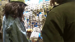
Beyoncé explained the concept of the video herself: "It's probably the most flamboyant video. (...) Everyone wanted to know what a 'freakum dress' was, and you can't really explain it, you have to see it. Everyone has their own version, so we had so many women — of different races, sizes, shapes, ages — because we all have those dresses we pull out when we need to shut it down." We took heavy inspiration from this music video, specifically the editing style of combining shots that are identical apart from certain minor but key features, like mise-en-scene changes. I have made some gifs to show examples of important parts of the music video we identified as worth recreating:
 (1)
(1) (2)
(2)
1. Within this gif, it shows Beyoncé making a shouting gesture with her hand and the women dancing in the background. In the first few frames she is in a pink dress lined with blue, and then, the frames after she is in a blue halterneck. She's recreating the motion, and the women are dancing again, giving the illusion that she did this all in one take.
2. In this gif the editing is much better. In this full body shot she crosses the set and the women dancing while in a plethora of dresses. The backing dancers also change costumes each step Beyoncé takes to the beat of the music.
 (1)
(1) (2)
(2) (3)
(3) (4)
(4)
1. This is not as heavily influenced from the Freakum Dress music video, but it's definitely lifted some conventions from it. As Lia sings to the Internet's Under Control, our song that we chose in the end, specifically the lyrics: "You know I'm telling you the truth" the shot changes from "you" to another shot, at a different location and time of day.
2. This is one of my favourite shots of the music video, as it blended seamlessly and showed a mixture of editing skills and differences in mise-en-scene; specifically outfit differences as well as location, on top of types of lighting. It linked the similarities and differences in our music video well, whilst showcasing our level of editing.
3. This was the most relatable shot connected to the Freakum Dress music video. This was matched spatially, and how everything is constructed including positioning of Lia and Charlotte, and the photo mise-en-scene included in Lia's hands. We used a match cut, which was consistently used throughout Beyoncé's video.
4. We used a match on action shot to link the beat of the music to the steps of Lia up the pathway. This created an extended shot that made the audience feel immersed in both the song and the music video.
Repeated sequence
A convention of real media products that we followed is the
use of repeated sequences throughout our music video. It is a common feature in professional music videos
that they will refer back to a certain sequence in the video more than once. As
a result of this, we decided to use this element in our own music video. We
decided that we should repeat one of the most important sequences in the video,
which is the opening scene. The feedback that we received from our target
audience after repeating this sequence throughout the video was very positive
and they liked the aspect of some of the shots reappearing. I also think that
we repeated the shots the correct amount of times, if we'd of done it too
frequently it could've become quite boring for the audience to watch.
Constructing our music video
In order to construct our music video, the main software program we used was iMovie. We decided to use this because it was a more straight forward program to use, with useful effects, transitions as well as texts to make our music video the best and the most conventional it can be.
 This, however, challenges common forms and conventions of real media products because professional music videos are not made through that. We were going to use Final Cut, but it was a lot more complicated and we did not have enough time to learn everything about it. iMovie was not as effective as Final Cut, and if we were doing this again, we would take more time out to learn Final Cut.
Initial Thoughts and Design
For our own music video we focused on the keyword “fun.” As
we didn’t choose a narrative, we very timidly went down the conceptual route as
we didn’t have a set narrative but we did envision how we wanted the music
video to look and what we wanted it to emulate. We had to be very careful when
thinking of the concept or feel we wanted to reflect for our video to ensure
that it appealed successfully to our target audience (18-22 year olds). Therefore,
we decided that the concept of our video should be focused on positive emotion
adolescents would experience whilst doing activities or visiting places. These
included going to the beach, or going to the photo booth with a friend, or
going to the art museum. Our target audience would relate to our music video,
meaning they are a lot more likely to enjoy viewing it. Moreover, it is often
that in real media products feature fun and enthralling concepts and designs.
An example of such would be Outkast
– Hey Ya! or Zico
– I Am You, You Are Me. As a result of this, our media product uses
the conventions of real media products.

Within Zico's breakout solo single, accompanied with a music video, he chooses to use mimicking and the theme of doubles and doppelgangers to create a quiet comedy as well as romance.
It attracts the same target audience that we want, so we tried to emulate the colouring and aesthetic style represented in this music video.
It attracts the same target audience that we want, so we tried to emulate the colouring and aesthetic style represented in this music video.

 As well as this, we also featured some clips in our video of
someone else who you can only see in a few shots. We decided to feature another
person in our video because it was originally completely focused on the artist
and after receiving some audience feedback that the video became quite
repetitive we decided that we needed to add something additional to our video
to make it more visually interesting.
As well as this, we also featured some clips in our video of
someone else who you can only see in a few shots. We decided to feature another
person in our video because it was originally completely focused on the artist
and after receiving some audience feedback that the video became quite
repetitive we decided that we needed to add something additional to our video
to make it more visually interesting.An example of an artist using other people in their music video would be Baby Bash, ft. Frankie J, in his song Suga Suga. There is a spectrum of women of different races, styles, etc, which also links to the diversity we were also striving to include.
Locations

Another thing we chose to do was use multiple, different locations. It is quite often that within a music video, it will feature more than one location, in order to keep the target audience interested and keep the essence of variety. For our own music video, we developed this convention by using a total of 4 locations, as well as 25 sub-locations within them.
We decided that it would be a good idea to use quite a few locations because our music video is mainly focused on the artist and her interactions with her environment and we thought that it in order to keep our audience interested in the video we must use a plethora of locations.
I think that it is effective that we used a many locations as well as many different types/areas of the locations because if we were to shoot all of our video in one or two locations it might have become quite repetitive for our audience to watch, and in turn, would have gotten boring.
Green screen
In contrast to this, one of the elements that we have
challenged against real media products is the use of a green screen. In professional music videos they have the
budget to be able to use the functions of a green screen— a common trope or
theme throughout music videos, which means that they do not have to travel far
distances to a variety of different locations. However, even though the option
of a green screen was available to us, we decided to not use it. Extending
fully the use of the amount of locations we had, and even more sub-locations,
we effectively decided to film certain shots in the real thing rather than the
green screen.
We decided to film a shot in front of Camden Lock, where our actress, Lia, crossed the camera in a long, wide angled shot, hovering on the wall. This ended up emulating a green screen shot, which you can see below.
We decided to film a shot in front of Camden Lock, where our actress, Lia, crossed the camera in a long, wide angled shot, hovering on the wall. This ended up emulating a green screen shot, which you can see below.

I think the foreground and background look very different,
in terms of colour as well as size. I believe the time of day we decided to shoot was the best as it left an outline around Lia that added to this green screen-like effect. This adds colour and flavour to our music video, and the still camerawork was a subverted common theme we decided to use to add individuality to our music video, and in turn, keep our audience interested.
In terms of our digipak...
Front Cover
 |
One of the ways our ancillary products- the digipak, the poster and the magazine advert- follow the codes and conventions of real media products, is how the same images are repeated throughout the work.
This is a common feature in real media products as they often want the artists work to be easily recognizable through music promotions, therefore the target audience begin to associate a certain image with the product which helps them think positively of the album.
I think that it is effective that we have used the same image throughout our work (Lia's outline is seen consistently, and her profile portrait where the lineart was taken from is seen too) because it means our artist can easily establish her own image.


 The back cover here was one of our ancillary texts that was definitely the most conventional. We included the font that was used throughout the digipak, included some fine print about who was involved in the album and about the record label just like a draft, or a real media product suggests. However, when creating our draft at first we did not want to include who featured in each song like referenced in the poster to continue the air of "mysterious youth" - running through the digipak and reflected by the artist - on the back of our album cover, so we decided to change it to just the song titles. We used the original image of our outline of our artist, to create synergy throughout this media product in its entirety. We also inserted legal information that was attuned to our artist and management. As our artist was discovered through BBC Introducing, we decided that they would help produce the album along with the management label "Odd Internet" stylized as "ODD INTNT" and so the legal information has "Unauthorised copying is punishable under federal law, from the BBC corporate." Our record label logo and a barcode onto the cover were added alongside this, just to match conventions and forms succintly.


This is a common feature in real media products as they often want the artists work to be easily recognizable through music promotions, therefore the target audience begin to associate a certain image with the product which helps them think positively of the album.
I think that it is effective that we have used the same image throughout our work (Lia's outline is seen consistently, and her profile portrait where the lineart was taken from is seen too) because it means our artist can easily establish her own image.

An example of us using forms and conventions of real media products would be the themes replicated within Anderson .Paak's "Cover Art" album. The sketchy design of the singer in the centre of the album, the black and white lines contrasted against the blue and yellow colour blocking brings the audience's attention to it. We attempted to mimic this with the gradient pink-purple colouring underneath the title and the line art of our actress,
First Inner Page

Our first inner page of our ancillary text definitely challenges the forms and conventions of authentic media products, as lyrics pages are a thing of the past. Within modern albums or digipaks, the lyrics page is nowhere to be found, as with the advancement of the internet, lyrics are as easy to find with quick Google. Adding one helps our artist find her roots, and take a modern musical audience back to the past with the printed lyrics.
Second Inner

We definitely developed this convention. Music artists today will usually thank people, for example the coordinators, their hair and makeup artists, their band mates if applicable, their management, their family, etc, and we decided to adapt this.
As we wanted to market our artist as someone universally approachable and, while conventional to a generic artist, we did everything a usual artist would, however we also let our fans:
- access the website and company that propelled our artist to fame, BBC Introducing
- receive a personal message from the artist on her website
Back Cover

Magazine Advert

Our magazine article isn't as conventional, but that was because we wanted to both challenge as well as develop the real media product forms.
An example of a generic magazine advert would be one for Taylor Swift's revamped album titled "Speak Now." There are some matching conventions, like the continuous font applied to the album title, comments about where to find it and when it drops, as well as a running colour scheme and the management company's logo. However, there are things we didn't include, like an image of the artist in the centre, or a scanning code to appeal to the younger part of the target audience.
We chose not to include those things as spacing within a magazine is crucial and we wanted the message to be subliminal that the artist cares more for information and communication that visuals or aesthetics.
Poster
Our magazine definitely develops themes, but mostly challenges them. We have stuck to the conventions by keeping the same colour theme throughout our digipack and music video, as well as using the initial image of the album cover. We have also included social media which is a convention of an advert/poster in order for the fans to make contact or interact with their artist, however, when I did my research I noticed that more and more artists are adding social media, but only simple things like Twitter, or their YouTube page. I think this is because social media is becoming more used and for younger artist who have a younger target audience are more likely to be in contact with there friends through social media, and so we decided to develop this form by adding as much as would be realistically possible. We have also followed conventions by making the name of our album in large font and placed the logo of the management company used in throughout our digipak.

In conclusion, I believe that both our main product and our ancillary texts have strong elements that follow the codes and conventions of real media products as well as also have aspects that challenge them.
I think that it is very important that, as a group, we carry out research and planning to stay ensured that our work followed the conventions as it meant that it is more likely to appeal to our target audience if they view something they are expecting to see.
However, as I have mentioned previously it is also important that we challenged some of these conventions within our work in order to create a fresh product that is increasingly attractive toward our target audience.
Subscribe to:
Comments (Atom)